Modern Home Design Ideas That Feel Fresh, Bold, and Totally Livable
Modern home design is the strategic fusion of clean geometry, natural light, and open, adaptable spaces that prioritize how you actually live. By stripping away unnecessary ornament and emphasizing durable, tactile materials like concrete, glass, and warm wood, it creates a calm, uncluttered backdrop that lets daily life breathe. This approach delivers both immediate comfort and long-term efficiency, as its smart layouts and passive solar orientation reduce energy waste while making every square foot feel intentional and expansive. Embrace it to transform your home into a serene, high-performance sanctuary that works for you, not against you.
What Defines the Look and Feel of Contemporary Living Spaces
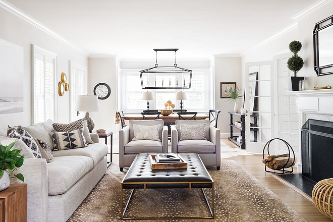
The look and feel of contemporary living spaces is defined by a quiet dialogue between clean architectural lines and the warmth of natural texture. In modern home design, you immediately notice the open floor plan, where the kitchen, dining, and lounge areas flow as one continuous volume, punctuated by sliding glass walls that dissolve the boundary to a private courtyard. The palette stays restrained—matte white, warm greige, and deep charcoal—while materials like raw oak, honed limestone, and brushed brass bring tactile depth. Furniture is low-slung and purposeful, avoiding ornamentation in favor of honest function. Strategic lighting layers, from recessed coves to sculptural pendants, create shifting moods after sunset, while large-format porcelain tiles and flush cabinetry reduce visual noise. The result is a calm, uncluttered backdrop where daily life feels intentional, and every object earns its place through utility or quiet beauty.
Key Visual Traits That Separate Modern Interiors from Traditional Decor

Modern interiors reject ornate moldings and heavy drapery, favoring clean sightlines achieved through flush surfaces. Where traditional decor relies on symmetrical arrangements and dark, stained wood, contemporary spaces use asymmetrical layouts and pale, matte finishes like limewash or microcement. Doors and window frames sit flush with walls, eliminating casing, while recessed baseboards vanish entirely. Furniture floats off the floor on slim legs, and lighting is architectural—linear pendants or track systems—rather than table lamps with fabric shades. Texture arrives via raw textiles like bouclé or linen, never carved details. Windows are unadorned, maximizing natural light, and built-in storage hides clutter behind slab fronts, contrasting with traditional exposed cabinetry and decorative hardware.
How Open Floor Plans and Natural Light Shape the Atmosphere
Open floor plans erase visual barriers, letting sunlight flood from one zone to the next, which instantly makes a home feel larger and more connected. Strategically placed windows and skylights turn daylight into a design tool, shifting the room’s mood from crisp morning energy to warm, golden evening calm. The seamless flow between kitchen, dining, and living areas means natural light becomes a shared resource, not a room-by-room luxury. Even on cloudy days, a cathedral ceiling with glass gables can keep the atmosphere buoyant and airy. The result is a living space that breathes with you, where shadows rarely settle and every corner feels intentional.
Question: How do open floor plans and natural light shape the atmosphere?
Answer: They create a continuous, sun-washed environment that promotes effortless movement, visual calm, and a subtle sense of expansiveness—transforming a house into a sanctuary that feels alive from dawn to dusk.
The Role of Neutral Palettes and Texture in Creating Calm
Neutral palettes—such as warm greige, soft oatmeal, and chalky white—form the visual baseline of a calm contemporary interior by minimizing chromatic noise. Texture then becomes the essential counterbalance, preventing these muted tones from feeling flat or sterile. Layering a bouclé armchair against a limewashed wall, or placing a chunky wool throw over a smooth leather sofa, introduces tactile depth that encourages slower, more mindful interaction with the space. *The quieter the color story, the louder the role of material contrast in defining spatial comfort.* This interplay ensures the eye has subtle stations to rest upon without the stimulation of bold hues. Neutral palettes and texture create calm by reducing visual stimulation while adding physical warmth, making a room feel both serene and inviting.
Q: Why do neutral palettes feel calmer than colorful ones in a living space?
A: Because near-monochromatic tones lower cognitive load—your brain processes fewer competing color cues—while varied textures still provide sensory richness, so the room feels tranquil without feeling empty.
Choosing the Right Materials for a Sleek, Low-Maintenance Home
For a sleek, low-maintenance home, prioritize surfaces that resist stains, scratches, and moisture without sacrificing minimalist aesthetics. Porcelain slabs and sintered compact surfaces offer large-format, seam-free installations ideal for countertops and wall cladding, requiring only simple soap-and-water wiping. Powder-coated aluminum or thermally modified wood excels for exterior cladding and decking, eliminating the need for yearly sealing or painting while maintaining a crisp, architectural line. Indoors, choose matte, through-body porcelain tiles over polished stone, as they hide smudges and do not require periodic resealing. For cabinetry, select laminate or acrylic finishes with a matte texture, which are more forgiving of fingerprints than high-gloss options. Ultimately, choosing the right materials for a sleek, low-maintenance home means investing in durable, non-porous surfaces that clean easily and retain their color and finish for decades, ensuring your modern design stays pristine with minimal effort.
Concrete, Glass, and Wood: Which Combinations Work Best
For a sleek, low-maintenance home, pairing concrete, glass, and wood works best when you let each material play to its strength. Try concrete floors with a warm walnut wood ceiling—the mass absorbs heat while the wood softens the acoustic echo, and both need only occasional sealing. Glass walls facing a courtyard shine when framed in dark-stained wood, which hides dust better than white trim. Avoid raw wood on exterior facades; instead, use charred cedar or composite decking beside concrete panels for zero painting. Inside, a concrete island with a live-edge oak countertop creates a striking tactile contrast.
- Use engineered wood or thermally modified timber where it meets concrete—it resists moisture warping.
- Pair matte glass with smooth-troweled concrete for glare-free, easy-wipe surfaces.
- Limit wood to vertical accents (slats, railings) so concrete and glass handle the heavy cleaning duty.

Selecting Durable Finishes That Age Gracefully
Selecting durable finishes that age gracefully starts with prioritizing materials that develop character rather than deterioration—think matte porcelain tile, quartz countertops, and powder-coated aluminum, all of which resist scratching and staining while maintaining a crisp, modern silhouette. Choose finishes with subtle, non-trendy textures like honed stone or brushed steel, because high-gloss surfaces reveal every micro-scratch, while textured options camouflage daily wear. Opt for through-body materials where the color runs entirely through the slab, so chips and edge wear blend seamlessly instead of exposing white cores. Avoid glossy lacquers on cabinetry; instead, use matte laminate or thermally fused melamine that won’t yellow or fingerprint. For flooring, select large-format rectified tiles with tight grout lines, reducing joints where dirt accumulates—this keeps the sleek look intact for decades.
Durable, low-maintenance finishes are those that embrace patina, hide micro-damage, and require only simple cleaning to stay timelessly modern.

Smart Storage Solutions That Keep Clean Lines Intact
Smart storage that keeps clean lines intact hinges on hiding the mess, not just organizing it. In modern home design, that means built-in cabinetry flush with walls, toe-kick drawers for infrequently used items, and recessed shelving that sits behind closed panels. Furniture does double duty—ottoman bases swallow blankets, while platform beds lift to reveal deep drawers without adding visual bulk. The key is to make storage a structural feature, not an afterthought:
When every inch of wall, stair, or void becomes a concealed compartment, the room reads as calm and uncluttered by default.
Choose push-to-open latches over visible handles, and keep countertops bare by tucking appliances behind lift-up doors. The result is a space that feels minimal and airy, yet functions like a well-oiled machine.
Built-In Furniture Ideas to Hide Clutter Without Sacrificing Style
Built-in furniture conceals clutter while preserving a room’s visual calm. A floor-to-ceiling wall unit with flush panel doors hides media equipment and paperwork behind seamless fronts, while a window-seat bench with a lift-up top stores toys or blankets without protruding hardware. For dining areas, a banquette with under-seat drawers and a hidden side compartment keeps tableware accessible yet invisible. A Murphy bed integrated into a millwork wall eliminates bulky bedroom storage, and a recessed bookshelf with a sliding panel masks a utility closet. These solutions rely on precise joinery and matching finishes. Concealed built-in storage maintains minimalist aesthetics by merging architecture with function.
- Use toe-kick drawers under lower cabinets for flat items like trays or files.
- Specify push-to-open mechanisms to remove visible handles from cabinet faces.
- Integrate a fold-down desk inside a tall pantry unit, shutting away office clutter.
- Design a built-in bench with hinged top and internal dividers for categorized stowaway capacity.
Multi-Purpose Rooms: Designing Flexibility into Every Square Foot
Multi-purpose rooms turn underused square footage into the most valuable asset in a modern home by concealing function behind clean surfaces. Built-in banquettes with hidden compartments allow a dining nook to become a workspace, while wall-bed units with integrated shelving transform a home office into a guest suite in seconds. Sliding pocket doors, rather than swinging hinges, preserve floor area and maintain uninterrupted sightlines. Choose furniture on casters or with fold-down mechanisms so a yoga studio becomes a playroom or a library becomes a bar. This approach ensures every square foot earns its keep. Designing flexibility into every square foot means prioritizing dual-purpose built-ins over single-task furniture, keeping visual noise low and daily adaptability high.
Balancing Minimalism with Warmth and Comfort
Balancing minimalism with warmth in modern home design hinges on choosing textured, natural materials that invite touch—think chunky wool throws, matte ceramic vases, and live-edge oak tables against crisp white walls. The trick is to keep the visual clutter at zero while layering sensory richness: a single sculptural floor lamp casts soft, amber light, and a deep, low-slung sofa becomes the room’s emotional anchor. Q: How do you prevent a sparse room from feeling cold? A: Introduce one oversized, tactile element—like a bouclé armchair or a nubby linen curtain—and let it do the heavy lifting. Rely on warm neutrals (oatmeal, clay, taupe) rather than stark black and white. Finally, leave visible negative space around every object, but fill that space with lived-in details: a stack of well-read books, a hand-thrown mug, or a worn leather ottoman.
Adding Soft Furnishings and Accent Pieces Without Overcrowding
To keep a modern room from feeling sterile, pick just a few textural layers that invite touch—think a chunky knit throw draped over a linen sofa or two velvet cushions in a muted tone. Instead of scattering trinkets, group one sculptural vase on a coffee table with a stack of books, then let the negative space breathe. Anchor the setup with a soft wool rug that defines the seating area without covering every inch of floor. This way, you get cozy minimalism without visual clutter, where each accent earns its place by adding warmth or function.
Using Statement Lighting to Define Zones in an Open Layout
In an open layout, statement lighting acts as a spatial anchor, carving distinct zones without erecting walls. A low-hanging pendant above a dining table establishes intimacy, while a sculptural floor lamp in a seating area signals relaxation. Layered light intensity is the key: use a dimmer switch on the central fixture to lower its output, then rely on a focused task light to define a reading nook. The contrast between a bright, ambient glow and a shadowed corner creates a psychological boundary that feels intentional, not accidental. Follow this sequence: first, map traffic flow; second, assign one visual anchor per zone; third, calibrate brightness to separate function from passage. Avoid placing two large fixtures in direct sightline, as they compete and blur the zone’s edge.
- Identify primary activity points (dining, lounging, working)
- Select one oversized light per zone with a distinct silhouette
- Test shadows at night to confirm the boundary holds

Practical Tips for Planning a Modern Remodel or New Build
Start by defining a **spatial budget** before a financial one—modern design lives or dies by flow, so map how each room connects to natural light and sightlines. Prioritize a “materials-first” palette: select stone, oak, and matte metal in the early planning phase, then let those choices dictate lighting fixtures and paint undertones. For a remodel, strip to the studs to expose ductwork and beams, because modern aesthetics reward honest structural expression over drywall concealment. Always pre-plan hidden storage for every device, cable, and appliance—minimalism fails the moment clutter appears.
Photograph your site at noon and dusk, then position glazing to capture that daily shift; the best modern plans are shadows and sun angles measured before a single blueprint is drawn.
Finally, mock up switch heights and outlet placements at standing and seated positions to keep clean lines from becoming an ergonomic nightmare.
What to Prioritize in the Design Phase to Avoid Costly Changes Later
Lock in your spatial layout and structural decisions before any finishes are selected. Every wall moved or window shifted after plans are finalized triggers re-engineering, permit delays, and reordered materials—the most expensive type of change. Prioritize a complete, frozen floor plan that includes exact appliance clearances, plumbing routes, and ductwork paths. Also verify ceiling heights and door swings now, not during framing. A single daylighting misstep, like an east-facing window without shade, is cheap to fix on paper but painful after drywall. Value engineering at this stage means asking “what if” for every load-bearing wall before pouring concrete, ensuring future flexibility costs nothing now.
Q: What is the single most impactful design-phase priority to avoid costly changes?
A: Finalizing your structural grid—walls, beams, and core utility positions—and refusing to alter it after permits are issued. That one constraint prevents cascading electrical, HVAC, and finish updates that multiply budgets faster than any aesthetic tweak.
How to Work with an Architect or Interior Designer for Best Results
Start by compiling a detailed brief of your spatial and lifestyle needs before the first meeting, including how you cook, work, and entertain. Share visual references—but not finishes—so the architect focuses on flow and massing first. Schedule decisions in phases: lock the structural plan before selecting tile or lighting. Request a single point of contact for all queries, and insist on a communication schedule—weekly updates or milestone reviews—so nothing stalls. When reviewing drawings, always ask “what does this change structurally?” before approving aesthetic tweaks. Budget for a contingency line for design revisions, and never move forward on verbal approvals alone; confirm every change in writing to avoid scope creep.
Clear briefs, phased decisions, and divine home written change orders yield the best results when collaborating with a design professional.
Common Mistakes First-Timers Make and How to Sidestep Them
First-timers often chase trendy finishes over function, then regret it within a year—prioritize durable, timeless materials for high-traffic zones. Another frequent slip is underestimating storage, leaving sleek spaces cluttered; map every item’s home before finalizing layouts. Many also ignore natural light angles, placing windows on the wrong elevations—observe sun paths during planning, not after framing. To sidestep budget blowouts, lock a 10% contingency before ordering anything, and avoid changing fixtures mid-build. Finally, don’t design in isolation; consult an architect early to catch flow flaws while plans are still digital. Smart first-time remodelers test lighting and cabinet heights with temporary mockups before committing.
Q: What’s the fastest way to avoid costly layout mistakes?
A: Tape out every room’s footprint on the floor with masking tape, then walk it daily for a week—you’ll spot tight corridors and awkward door swings before pouring a single foundation.